|
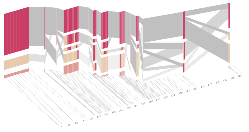
<< BEN FRY isometricblocks When comparing the genome of two different people, you'll see single letter changes (called SNPs, pronounced ‘snips’) every few thousand letters. An interesting feature of SNPs is that their ordering has distinct patterns, where sets of consecutive changes are most often found together. There are many methods for looking at this data, so this piece combines several of them into a single visual display. The project is described in greater detail in my dissertation, starting in chapter four. This work was developed between 2002 and 2004 using alpha releases of Processing. The version on this page was ported to JavaScript (with no additional changes) in 2013. |
|
The groupings of patterns are sometimes referred to as "haplotype
blocks". This was discussed in a paper (Daly, et al, 2001) that looked
at a section of the genome of ~500 people in search of Crohn's disease
(Rioux, et al, 2001). The data from that paper is also used in the image above.
The colors in each row depict one of (only) two variations possible for each SNP, the most common in dark red, less common in a paler color. At the bottom of each column, a category for those variations occurring in less than 5% of the population. At a glance, this diagram can be used to quickly discern the general structure of the population in question, with roughly 75% of those studied exhibiting the haplotype block shown in the first column, and others that continue towards the right. Such an image is used in contrast to simply showing a chart with percentages, which requires the viewer to consider the relative importance of each percentage, rather than simply “seeing” it. Because size information can be processed pre-attentively (described in section 3.1 of the dissertation), the mind processes the basic structure of the diagram before conscious thought is given to it. One difficulty, however is that the diagram above is shown with each SNP having a width equal to the distance to the next SNP, causing markers that are close together to be lost, and the frequency of transitions between each block (the gray bars) predominating, when they're only secondary information. The alternative approach is to click 2D Even Spacing which will give each SNP (and each transition between the blocks) equal spacing, while maintaining a connection to the “real” scale using lines at the bottom of the image. This view is useful for learning the exact letters that are in use. Some find the block definition controversial (mostly because it can be taken too literally), so the use of an interactive software program that allows one to modify the parameters of the mathematics used to set boundaries on the blocks helps reinforce the notion that the blocks are themselves not meant as rigidly as might be implied by their name. In the lower left-hand corner, a series of parameters for the statistic can be modified: Cut High CI is the "high cutoff for the confidence interval" used in correlating the blocks (the algorithm used is described in Gabriel, et al, 2002). "Rec" is short for recombination, and "LD" means "linkage disequilibrium". Moving the parameters in the opposite direction would produce a far more mixed picture than the original. This method of directly manipulating the values helps reinforce for the user how the algorithm itself works. The rapid feedback of simply manipulating the cutoff rate as an on-screen slider allows changes to be made in a way that is non-destructive, allowing the viewer to test different values but easily return to a previous state by a 'reset' function (hit the letter r on the keyboard to reset to its original state). As another alternative, the block diagram can be shown in 3D, where each block offsets slightly in the z-axis, so that the lines depicting the transitions between blocks can be seen more clearly. The view helps expose the transitions between blocks that are immediately adjacent one another. A “false” 3D isometric projection is employed that allows the data to be shown while preserving the linear scaling of the nucleotide scale in the horizontal axis. It is likely placing too much emphasis on a few lost transitions to assign an additional spatial dimension to them. To make better use of the z-axis, the 3D with LD Units view will set the z-axis to “LD Units”, another measure of this phenomenon described in Zhang, et al, 2002. This mixes the block diagram with an additional level of confirmation which works well because the stair stepping seen in the LDU map is reminiscent of the block definition. When the user enables this mode, the software slowly moves each bar to its new position, so that the transition can be seen. An additional keypress moves back to the original layout so that the two views can quickly be compared. The user can easily transition between each type of view, enabling or disabling the three dimensional view if not needed, or modifying the block definition as appropriate, to see how things work. The LD Units from above rotates the diagram to view it from the top, to show just the two dimensional plot of LD units. This type of exploration provides many different perspectives into the data, relying on the fact that users may have different goals in mind when observing the data, and personal preferences as to how they prefer to see the data represented. To this end, the 2D Quantitative display simply shows the raw letters of the data and the percentage for each, as opposed to the more qualitative visual block diagram. The software is built to morph between the representations, providing a tight coupling between the qualitative—useful for an initial impression and getting a “feel” for that data, with the quantitative—necessary for determining specific frequencies of haplotypes of interest for specific study. Additional perspectives on this data can be achieved through other user interaction, clicking on a particular block varies the line weights of the transitions to show how many of the transitions are related to the highlighted block, dynamically building a tree of how the correlation of that group of letters breaks down in its occurence. For more advanced users, hitting the letter k, will show a line graph of D' values for each SNP relative to the others, as you roll over it with the mouse. Usually this data is shown as a 2D half-matrix, so this provides a far more compact view than a full D'plot, which often takes up far too much space for the amount of information that can usefully be extracted from it. Pressing the z, x, and c keys allows the user to switch between populations (i.e. affected versus unaffected individuals), showing how the frequency of particular haplotypes increases or decreases. The many dimensions in genetic variation data necessitate multiple perspectives for how it is viewed, and an interactive software visualization provides a means to transition between these views in an informative manner, showing how the many views are related, yet at the same time highlight different aspects of the data set. |
|
EARLY SKETCHES The interactive version at the top of the page is the result of several iterations. Two earlier (print) versions are shown below (click either for a detailed sample). ;)
;)
The representation on the left simply connects each line of variation to the other lines with which it is found. The result is the heavily intertwined form of hairlines, with the variations listed in order of relevance, with more relevant data being found towards the bottom (the denser sets of letters). This wasn't intended as something useful, but was more a semi-inspired happy semi-accident on the way to the image at the right. The righthand image further condenses the sets of variations, and modifies line weight based on how often the sequences are found adjacent one another. With this representation, it is possible to see major trends, the ones sorted towards the top, that are prevalent in the data set. But it still requires too much space for not enough information. REFERENCES Daly, Mark J. et al. High-resolution haplotype structure in the human genome. Nature Genetics 29, 229-232 (October 2001) Letters. Gabriel, Stacey B. et al. The Structure of Haplotype Blocks in the Human Genome. Science 2002 296: 2225-2229. Rioux, J.D. et al. Hierarchical linkage disequilibrium mapping of a susceptibility gene for Crohn's disease to the cytokine cluster on chromosome 5. Nature Genet. 29, 223-228 (2001). Zhang, W. et al. Properties of linkage disequilibrium (LD) maps. ACKNOWLEDGEMENTS This project was done as part of my Ph.D. work at the MIT Media Laboratory in John Maeda's Aesthetics and Computation Group (ACG) and with additional advice from my dissertation committee (Chris Pullman and David Altshuler). Thanks to Andrew Collins for providing the LD unit data for this particular data set. << BEN FRY |