|
<< ben fry
valence Valence is a set of software sketches about building representations that explore the structures and relationships inside very large sets of information. Genome Valence is the most recent incarnation of this software. It visualizes biological data and was created for the Whitney Biennial in 2002. A simplified online version of the text-analyzing valence was built with Processing. The full version (shown here and in the video) was created with C++, Perl, and OpenGL. This project makes an appearance in the movie Minority Report thanks to John Underkoffler, the film's Science & Technology Advisor. Another edition of valence compares two German books, for a 2001 installation at the Ars Electronica Center in Linz, Austria. This page primarily covers the original version of Valence (first developed in early 1999), which was developed as part of my Master's Thesis titled Organic Information Design. The thesis has more in-depth information about the project and its methods than what's descibed here. View a movie of Valence. | |
|
| |
|
I'm interested in building systems that create
visual constructions from large bodies of information.
The methods used in designing static chunks of data: charting,
graphing, sorting and the rest (see the books by Tufte for
the complete run-down) are well understood, but much interesting
work remains in finding models and representations for examining
dynamic sources of data, or very very large data sets.
For this work, I'm employing behavioral methods and distributed
systems which treat individual pieces of information as
elements in an environment that produce a representation
based on their interactions.
Valence is a software experiment
that addresses these issues.
| |
|
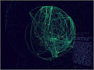
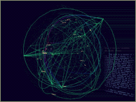
an example The image on this page is taken from a visualization of the contents of the book "The Innocents Abroad" by Mark Twain. The program reads the book in a linear fashion, dynamically adding each word into three-dimensional space. The more frequently particular words are found, they make their way towards the outside (so that they can be more easily seen), subsequently pushing less commonly used words to the center. Each time two words are found adjacent in the text, they experience a force of attraction that moves them closer together in the visual model. The result is a visualization that changes over time as it responds to the data being fed to it. Instead of less useful numeric information (i.e. how many times the word 'the' appeared), the piece provides a qualitative feel for the perturbations in the data, in this case being the different types of words and language being used throughout the book. why is it effective? The premise is that the best way to understand a large body of information, whether it's a 200,000 word book, usage data from a web site, or financial transaction information between two multinational corporations, is to provide a feel for general trends and anomalies in the data, by providing a qualitative slice into how the information is structured. The most important imformation comes from providing context and setting up the interrelationships between elements of the data. If needed, one can later dig deeper to find out specifics, or further tweak the system to look at other types of parameters. | |
|
| |
|
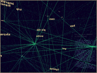
other applications The book example is imperfect, because it lacks a direct application, so it fails to be something that's immediately useful. It isn't doing any sort of complicated lexical analysis on the book, but rather treating it as a source of generic information (in this case a string of words) like any other. This method has also been applied to visualization of user traffic on a web site (the images above this paragraph were taken from the web site usage version of Valence). The words in the above example were replaced by web page URLs. Instead of a typical web usage report comprised of bar charts which told you obvious information such as "80,000 people visited the home page" and accompanying numbers for other pages, it would actually build a self-evolving map of how people had been using the site. The layout of this map was driven by traffic patterns, rather than the structure the site's designer had put in place, providing additional information on how well the site had been constructed. The result was an ever-changing look at how the nature of the site's traffic evolved through time. | |
|
| |
|
about the representation These images are the result of spending a good deal of time trying different methods of visualizing data in three dimensions. The images interspersed throughout this page are some of the iterations of this project. | |
|
| |
|
future directions I'm working on newer concepts related to these ideas, pushing further into the realm of complex adaptive systems. I'd like to continue building models that become progressively more sophisticated in their ability to relate to an information feed, in a similar fashion to biological systems. | |
|
| |
|
for more information This page provides only a rough sketch of the project and its goals, please see my thesis for more information. Neither the binary nor the source code for this project are available at this time. This may happen in the future, but for now I'm too busy with other projects. | |
|
| |
|
<< ben fry The images on this page are © Copyright Ben Fry and the Massachusetts Institute of Technology. Permission is required for their use and/or reproduction. | |